Thu, Oct 30
Forms and frameworks
Today's objectives
Understand the basics of grid systems and frameworks. Introduction to the Skeleton framework.
- Review assignment
- Grids
- Frameworks and grid systems
- Skeleton Framework
- Getting started
- Skeleton grid
- Responsive images
- Other features
Tasks
Explore the basics of the Skeleton framework.
Presentations
Planning and prototyping
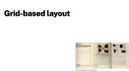
Grids
Intro to the Skeleton framework
File paths
Agenda
Preparation
Remember the readings assigned last class.
Tutorials
Resources
Design interfaces with standard Apple User Interface elements
Design interfaces with Google's standard UI elements
Planning and prototyping
- Paper prototyping
- https://uxplanet.org/the-magic-of-paper-prototyping-51693eac6bc3
- Wireframe Sketching
- https://www.nngroup.com/articles/draw-wireframe-even-if-you-cant-draw/
- Design process: the "double diamond"
- The Double Diamond model
A low-tech way to develop and test ideas
A general approach for design of any kind.
CSS Grids and layouts
- Basic CSS layouts
- https://www.w3schools.com/css/css_templates.asp
- Modern CSS Layout
- https://developer.mozilla.org/en-US/docs/Learn/CSS/CSS_layout/Responsive_Design
Planning and prototyping
- Site planning process
- https://www.printmag.com/editors-picks/phases-of-the-web-design-process/
Samples
Here you will find any sample files or code samples you need for class.
1: Skeleton basics
See the Pen Untitled by Robert Currie (@rcurrie) on CodePen.
2: Skeleton responsive images
See the Pen Responsive images test by Robert Currie (@rcurrie) on CodePen.
3: CSS "sketching"
See the Pen CSS Sketching by Robert Currie (@rcurrie) on CodePen.
Tools
- Adobe XD
- Part of the CC suite.
- Figma
- A (very good) web-based prototyping tool
- Sketch
- The first prototyping tool to be widely adopted and still one of the most popular
Professional practice
Being familiar with a range of planning and prototyping tools is vital. Don't forget about paper, whiteboards and other low-tech tools. Nothing is as immediate as picking up a pen and sketching.
Need help?
Contact me - Slack is best.


